Round Trip Planner and Strategic Product Design for TomTom GO Ride

TomTom, a company with a legacy in consumer navigation products, had been experiencing a decline in its traditional consumer goods business. With outdated mobile apps and declining sales of sat navs, the company sought to pivot toward niche markets to rejuvenate its product portfolio.

GO Ride was born as an effort to target motorcycle riders, a niche audience with specific navigation needs. The goal was to create a competitive navigation app tailored to their journeys.

Early stages of the project

My role, as part of the product design team, spanned over a year and included designing multiple features from start to finish, establishing the app's visual identity, and contributing to strategic milestones like monetization.

Early in the project, I have focused on foundational features to release a beta version for free and attract a small but engaged audience. These included:

– Account and profile creation

– Favourites management

– Search functionality

– Speed camera alerts

– UI and Visual design

Case study milestones

As the app gained traction, with over 60,000 users, we worked toward monetization while maintaining the app’s unique focus on motorcyclists.

This case study explores my contributions to three key milestones:

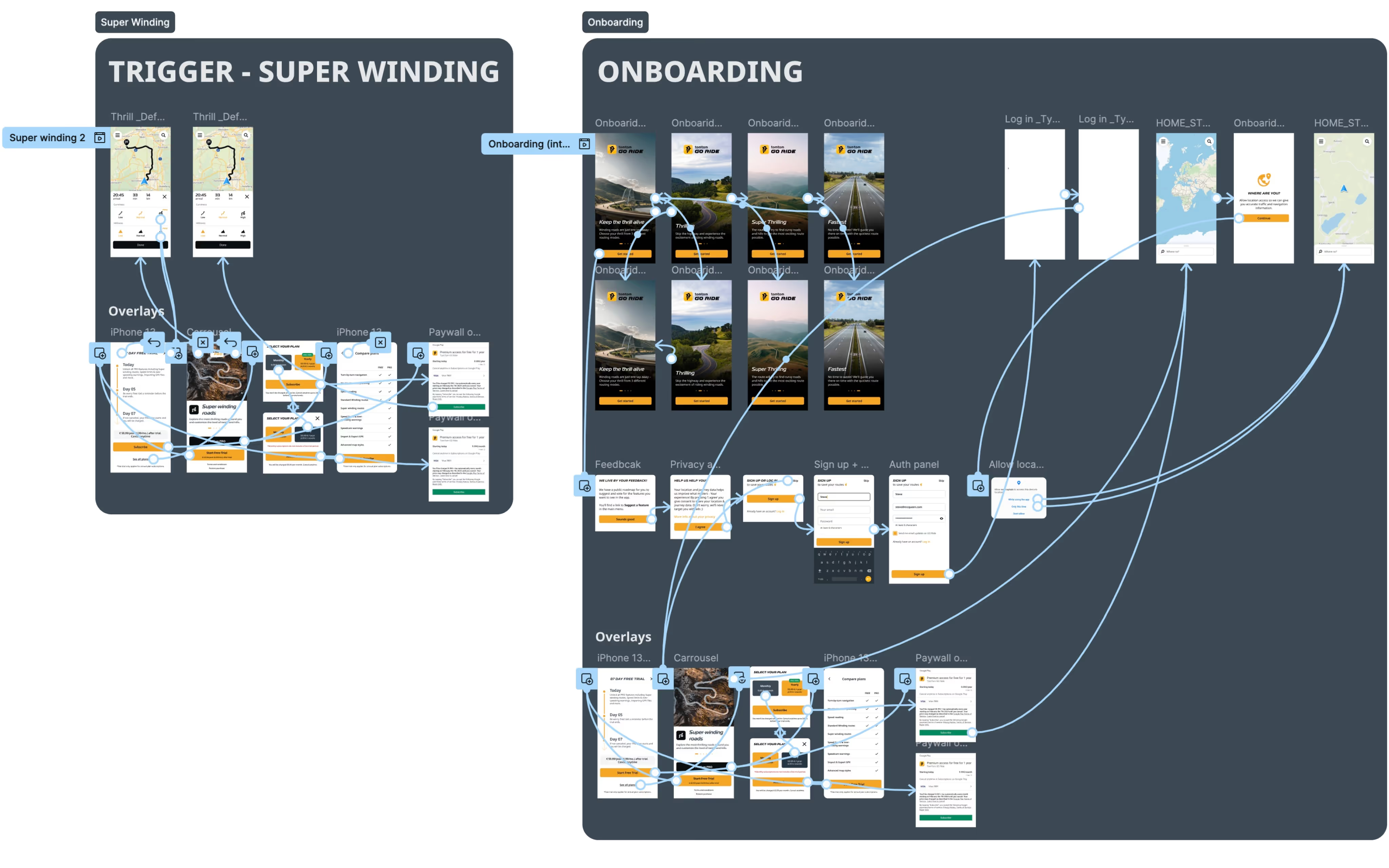
– Designing and implementing the paywall and monetization strategy

– Crafting the PRO tier branding and visual assets

– Creating the Round Trip Planner, which became the app’s most-used feature.

Main outcomes – Delivering Engagement and Monetization Readiness

– 60,000 engaged users by the time of project cancellation.

– A 20% reduction in onboarding drop-off after introducing the Round Trip Planner, which became the app’s most-used feature.

– A thoughtfully designed paywall strategy, supported by user testing and collaboration with experts, that was ready for launch.

– A visually cohesive, motorcyclist-focused app identity, blending a sporty, bold font with large accessible UI, and illustrations and photography matching the brand.

Designing for Monetization and Engagement – Key milestones

1  – Paywall Integration to Drive Monetization

2 – Crafting a Cohesive PRO Tier Visual Identity

3 – Creating the Round Trip Planner to Boost Engagement

1

Paywall Integration to Drive Monetization

Challange

Monetizing the app required implementing a paywall to introduce a PRO tier, locking key features behind a subscription. This needed to be done in a way that encouraged upgrades while maintaining a strong user experience.

Process

– Conducted two rounds of user testing with real users to assess the pricing strategy, flow, and reception of the paywall.

– Collaborated with CRM and conversion experts within the company to finalize the strategy.

– Designed and oversaw the implementation of the paywall using a third-party tool, Purchasely, ensuring a smooth technical integration.

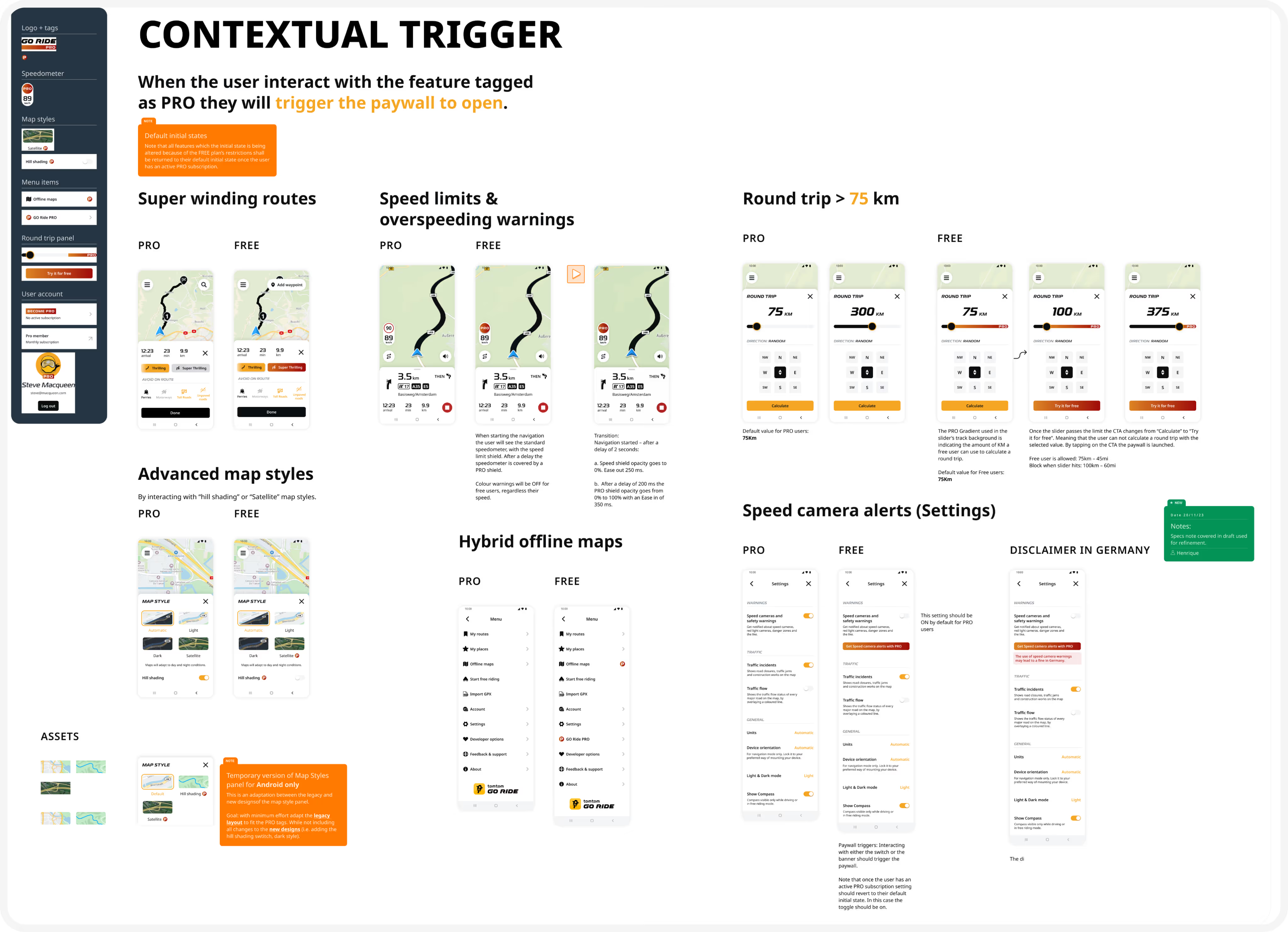
– Created UI and visual assets that clearly indicated which features were part of the PRO tier, enhancing transparency and usability.

Outcome

The final flows and assets balanced conversion goals with user experience, preparing the app for a smooth transition to monetization.

2

Crafting a Cohesive PRO Tier Visual Identity

Challange

Establish a strong visual identity for the PRO tier while maintaining consistency across the app’s design.

Process

– Designed badges, icons, and other brand assets to highlight PRO features, ensuring they were clearly distinguished from free features.

– Integrated the assets seamlessly into the app, using a consistent design language that reinforced the brand.

– Collaborated with the marketing team to align visual assets with the app’s sporty and bold aesthetic, catering to the motorcycle community.

Outcome

The PRO branding clearly communicated value to users while blending harmoniously with the app’s overall design.

3

Designing the Round Trip Planner to Boost Engagement

Challange

Deliver a technically feasible solution for a feature that allowed motorcyclists to plan round trips. A key challenge was relying solely on TomTom’s proprietary technology, with no external APIs.

Process

– Worked closely with developers to understand technical constraints and identify opportunities within TomTom’s tech stack.

– Designed user flows, wireframes, and prototypes to validate the concept.

– Iterated on the design through collaboration and feedback, culminating in final flows and specifications that worked seamlessly within the app.

Outcome

The Round Trip Planner became the app’s most-used feature, reducing onboarding drop-off by 20% and significantly improving user engagement.

Impact

User Adoption and Engagement Metrics

User Base: Grew to over 60,000 users, with strong engagement metrics.

Feature Usage: The Round Trip Planner became the app’s most-used feature, demonstrating its value to motorcyclists.

User Feedback: Received positive feedback for the app’s usability, accessibility, and visual identity.

Reflections

Lessons Learned: Growth Through Resilience and Adaptation

– Strong cross-functional collaboration (e.g., working with CRM experts, developers, and marketing) was key to delivering impactful solutions.

– Early and iterative user testing can significantly refine monetization strategies and improve the overall user experience.

– Detachment from end results is an essential skill—projects may pivot or be canceled, but the experience and skills gained remain invaluable.

What's next?

While GO Ride was canceled before the paywall’s launch due to a company-wide strategy shift, the experience prepared me for new challenges. As TomTom shifted focus to developing its new flagship app, I carried forward the lessons learned to tackle new opportunities in designing impactful and user-centric solutions.